


 Kar Bachat Yojana
 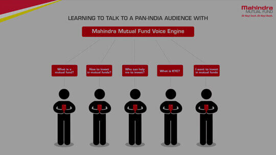 MAHINDRA MUTUAL FUND
 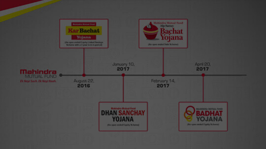 MMF NFO Launches
 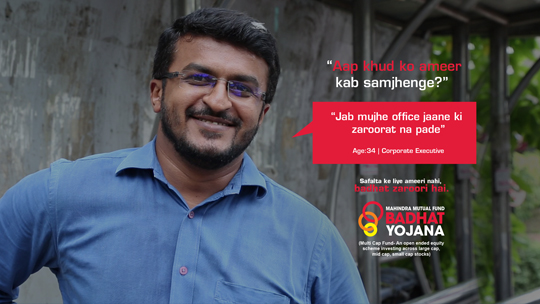 MMF BADHAT YOJANA
  UNNATI EMERGING BUSINESS YOJANA
 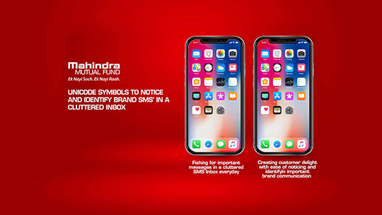 MMF TEXTMOJI
  Mahindra Pragati Yojana
  Mahindra Rural Bharat
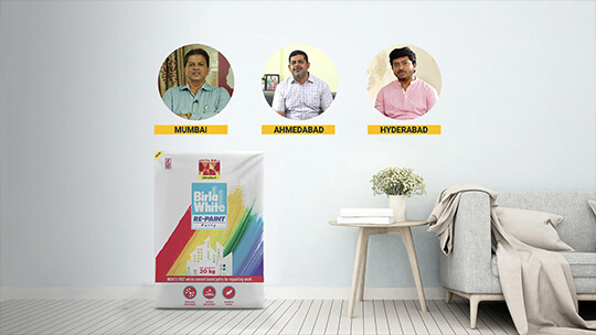
 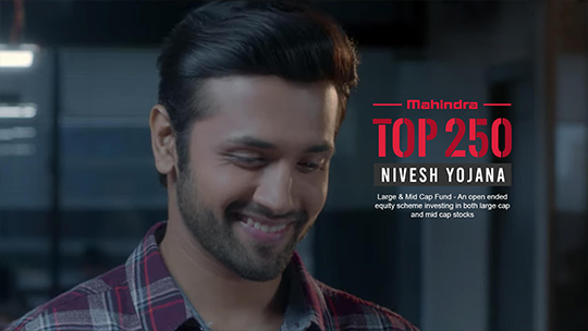 TOP 250 NIVESH YOJANA
 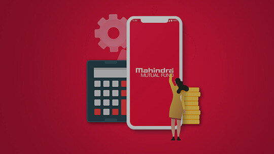 MAHINDRA MUTUAL FUND APP
  Ted Ar Innovation
 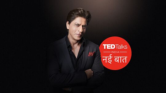 Ted Talks Nayi Baat
  The Voice
 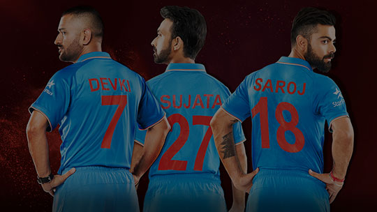 Nayi Soch
  TED TALKS INDIA
  Kasauti Zindagi ki
  Kasauti Zindagi ki AR
  Ek Bhram Sarvagun Sampanna
  Kulfi Missed Call
  Star Second Screen
  Star Brand Refresh
 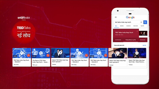 TED GOOGLE CARDS
  Nach Baliye 8
 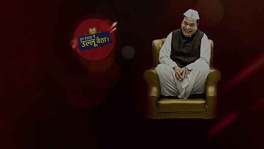 HAR SHAAKH PE ULLU BAITHAA HAI
  KULFI
KULFI  KHICHDI
  VYNG
VYNG  TGILC
TGILC 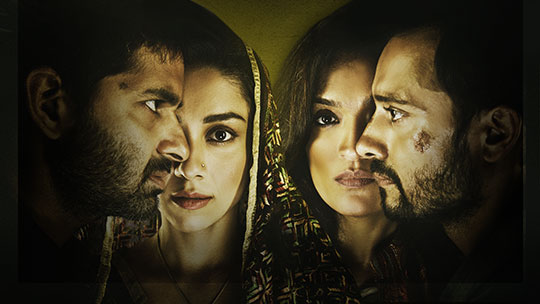 'POW' Bandhi Yuddh ke
  The Jungle Book
  M.S. Dhoni
 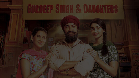 Women's Day
  Made By Mom
  Ishqbaaaz
  Dance+2
  Ikyawann
  Baaghi 2
 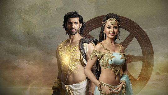 Karn Sangini
  Nazar
Nazar  Sanju
Sanju  Stree
Stree  Star Writers Program
  Piramal Enterprises
  Piramal Pharma
  Piramal Capital
  Piramal Housing
  Brickex
  India RF
  Piramal Capital Housing Finance
 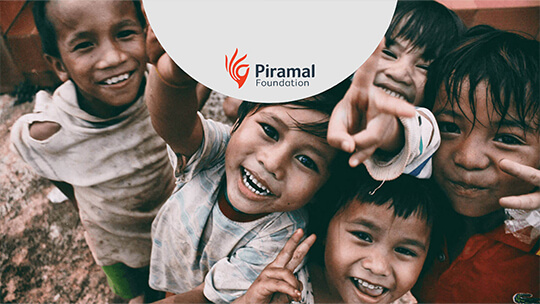 Piramal Foundation
  Gandhi Fellowship
  iCanHelp
  OurDaily
  TriActive